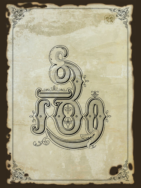
Sree, a nomenclature or title equivalent to ‘Mr.’ in English; denotes radiance or prosperity. Sree-Ka-ram is a creative cohesion of three characters integrated into one letterform: ‘Sree.’ The idea was to have an ornate character in Telugu showing the entire word comprising of three letters in a single letterform. An ancient parchment with burnt out edges is used as background to complement the letterform.
Concept: Drop Caps or Dingbats were earlier used to emphasis the beginning of a text in several languages. Earlier, on letterpress books, writing ‘Sree’ or using ‘Dingbats’ at the beginning of a piece, were used as a good omen OR to mark the starting and end point.

With the increase of digital composition and web-based content, possibly owing to readability and on-screen rendering issues, the use of Ornate Drop Caps is being gradually omitted. Sadly thus, most of the wondrous craft of creating these beautiful ornamented letterforms to mark the beginning of a book or a letter etc., is lost. However, in Telugu, a few words like శుభలేఖ (invitation), పెండ్లి పిలుపు (Wedding Invitation), ఆహ్వానం (Invitation) etc., are still artistically designed to convey a welcoming message.

In contemplating to do something similar, I gave a genuine try, with the result Sri-kar-am became a beautifully embellished form, with the letter trio embedded in a single ‘Sree.’
Initial Sketches: My first assignment took off as a Drop Cap but ended as an ambigram! In creative artistry, I believe it is imperative or rather a dictum, to keep options open, as we may never know where we might end up, or with what. As an attempt, I chose ‘శ్రీకారం’ (Sreekaram i.e. Begining).

Initially it was just a simple ‘శ్రీ’ but upon closer observation, I could figure out three other characters: ’కా & రం’ in ‘శ్రీ’ to make the absolute word ‘శ్రీకారం.’ That is how my idea of a single letter ‘శ్రీ’ got transformed to the word ‘శ్రీకారం.’


Comments